Table of Contents
Want to make your charity event unforgettable? It all starts with grabbing people's attention, and what better way to do that than with a killer poster? Think of your charity event poster as your event's superhero cape – it needs to be bold, eye-catching, and make people want to join your cause. But let's face it, designing a poster that actually works can feel like trying to solve a puzzle with missing pieces. Where do you even begin? What makes a poster go from "meh" to "must-attend"? In this article, we're breaking down the secrets to creating charity event poster ideas that don't just look good, but actually get people through the door (or onto your donation page). We'll cover the essential elements of a winning poster, explore creative concepts, and give you practical tips to make your poster stand out from the crowd. Ready to design a poster that packs a punch for your charity event? Let's get started!
Why Your Charity Event Needs a Killer Poster
Why Your Charity Event Needs a Killer Poster
Let's be real, nobody shows up to a party they don't know about, right?
Same goes for your charity event.
You could be throwing the most heartwarming, life-changing, fun-filled charity event of the century.
But if nobody knows about it, you might as well be talking to a brick wall.
That's where your poster comes in.
Think of it as your event's personal hype-man, shouting from the rooftops (or at least from community boards and social media feeds) why people absolutely HAVE to be there.
A killer poster isn't just pretty pictures and fancy fonts; it's your event's first impression, its loudest cheerleader, and sometimes, its only chance to make a splash.
MustHave Elements for Effective Charity Event Poster Ideas
MustHave Elements for Effective Charity Event Poster Ideas
Clarity is King (and Queen!)
Seriously, if people have to squint or decode your poster like it's some ancient hieroglyphic, you've already lost them.
Your poster's main job is to tell people, super fast, what's going on.
Think of it like shouting your event details from a crowded street – you need to be loud, clear, and to the point.
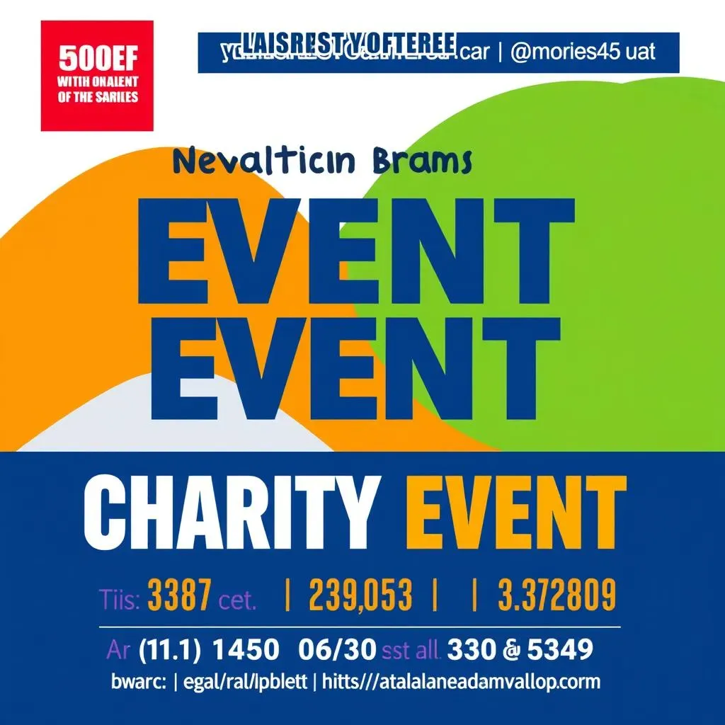
Big, bold text for the event name, date, time, and location are non-negotiable.
Make sure this info jumps out at anyone glancing at your poster, even from a distance.
Visuals that Pop (But Not in a Bad Way)
Nobody wants to stare at a wall of text.
Pictures are your poster's best friend.
A strong image or graphic can instantly grab attention and give people a feel for your event.
Are you hosting a fun run? Show people running!
A gala dinner? Elegant imagery is your go-to.
But here's the kicker: keep it relevant.
Random stock photos of puppies might be cute, but if your charity event is about building schools, maybe show some kids learning instead?
Just a thought.
- Crystal Clear Information: Event Name, Date, Time, Location - Make it HUGE and easy to read.
- Eye-Catching Visuals: Images or graphics that are relevant and engaging. No blurry photos, please!
- Call to Action: Tell people what to DO! "Buy Tickets," "Donate Now," "RSVP Here." Don't leave them hanging.
- Contact Info: Website, phone number, email – how can people find out more or get involved?
- Branding (Subtle but Present): Your charity's logo, colors – keep it consistent with your overall brand.
Charity Event Poster Ideas: From Concept to Creation
Charity Event Poster Ideas: From Concept to Creation
Brainstorming Bonanza: What's Your Poster's Big Idea?
Alright, so you need a poster.
Before you even think about fonts or fancy colors, you gotta nail down your concept.
Think of it like this: your poster is a tiny billboard for your cause.
What's the one thing you want people to feel or think when they see it?
Are you going for heartwarming and fuzzy, or urgent and action-packed?
Let’s say you’re doing a dog adoption event.
Cute puppies? Definitely.
But maybe twist it up a bit.
Instead of just puppy pics, how about a "Doggy Speed Dating" theme?
Suddenly, it’s fun, quirky, and memorable.
Boom, concept achieved.
Design 101: Making it Look Good (Without Crying)
concept’s cooking.
Now for the visual stuff, which can feel like learning a new language, but trust me, it’s not rocket science.
First up: keep it simple, buttercup.
Too much clutter is like visual noise.
Focus on a few key elements: a strong headline, a knockout image, and your crucial info (date, time, etc.).
Color-wise, think about your charity's vibe.
Serious cause? Maybe stick to calmer, more professional colors.
Fun run? Go bright and bold.
Just don’t make it look like a unicorn threw up rainbows unless that’s your actual event theme.
Fonts are next.
Please, for the love of all that is holy, no Comic Sans.
Pick fonts that are easy to read and match the tone of your event.
Bold and blocky for impact, cleaner and simpler for elegance.
Design Dos | Design Don'ts |
|---|---|
Keep it Simple & Clear | Clutter with too much text |
Use High-Quality Images | Use blurry or pixelated images |
Choose Readable Fonts | Use overly fancy or illegible fonts |
Strategic Use of Color | Random, clashing colors |
Whitespace is your friend! | Cram everything together |
Tool Time: From Fancy Software to Freebie Fun
So, how do you actually *make* this poster magic happen?
If you're a design whiz with Adobe Photoshop, go for it.
But for the rest of us mortals, there are way easier options.
Online design platforms like Canva are lifesavers.
They’ve got templates galore, drag-and-drop features, and even free versions that are surprisingly powerful.
Plus, they won’t make your brain melt trying to figure them out.
If you’re feeling extra thrifty (and who isn’t when it comes to charity?), check out free design tools like GIMP (it’s like free Photoshop, but a bit clunkier) or even good old Google Slides or Docs can work in a pinch for basic posters.
The key is to pick a tool you’re comfortable with, so you can focus on your awesome poster content, not wrestling with software.
Getting Your Charity Event Poster Seen: Tips and Tricks
Getting Your Charity Event Poster Seen: Tips and Tricks
Beyond the Bulletin Board: Think Wider for Poster Placement
So, you've got this amazing poster, but it's just sitting in your office gathering dust.
That's like baking a cake and then hiding it in the closet – pointless, right?
Posters are meant to be seen!
Forget just slapping it on any old bulletin board and hoping for the best.
Think strategically.
Where does your target audience actually hang out?
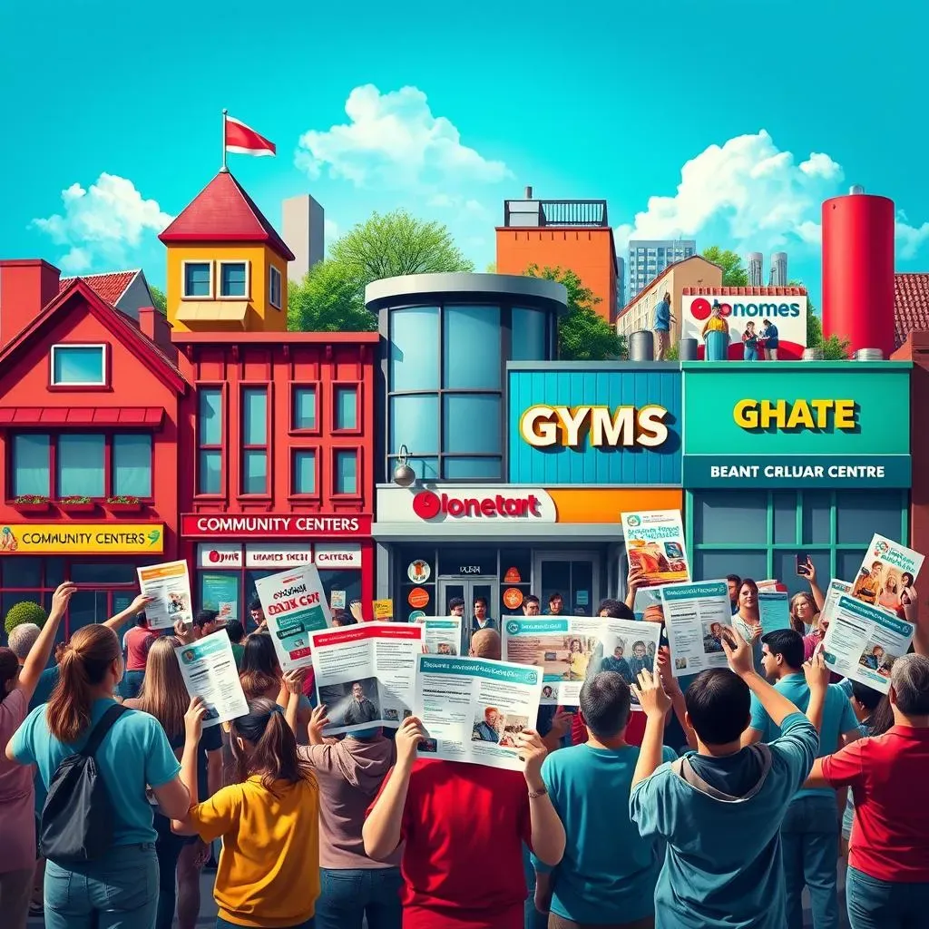
Local coffee shops are gold mines.
Ask if you can put up a poster – most places are happy to support a good cause.
Community centers, libraries, even gyms – these are all spots where people are already looking at boards and walls.
Don't forget local businesses that align with your charity's mission.
Pet supply stores for animal shelters, bookstores for literacy programs – you get the idea.
Digital Domination: Social Media and Online Visibility
physical posters are cool, but we live in the digital age, people!
If your poster isn't online, it's missing out on a huge chunk of eyeballs.
Social media is your best friend here.
Share your poster on all your charity's platforms – Facebook, Instagram, X, the whole shebang.
Make it your cover photo for a week.
Post it regularly leading up to the event.
Use relevant hashtags like #charityevent #fundraiser #[yourcity]charity to reach a wider audience.
And don't just post the image and run.
Write engaging captions that tell people what the event is about and why they should care.
Boosted posts can also be worth considering if you have a bit of budget to play with.
Also, put your poster on your charity's website, and if you send out email newsletters, include it there too.
Basically, plaster it everywhere online without being spammy, of course.
Online Poster Promotion Checklist | Details |
|---|---|
Social Media Posts | Regular posts on all platforms (Facebook, Instagram, X, etc.), engaging captions, relevant hashtags |
Website Placement | Homepage, events page, blog posts |
Email Marketing | Include in newsletters, event announcements |
Online Communities | Share in relevant Facebook groups, forums, local online groups (with admin permission!) |
Guerilla Marketing Tactics: Creative and Unexpected Placement
Want to get really noticed?
Time to get a little creative and think outside the box – or, well, outside the bulletin board.
“Creativity is intelligence having fun.” – Albert Einstein.
Think about printing smaller, flyer-sized versions of your poster and asking local businesses if you can leave a stack at their counter.
Bookstores, cafes, even grocery stores sometimes have community boards or spaces for flyers.
If your event is kid-friendly, ask schools or daycares if you can put up a poster or send flyers home with kids (always with permission, naturally!).
Partnering with other local organizations or businesses can also be a win-win.
Maybe a local bakery will put up your poster in exchange for you mentioning them as a sponsor on social media.
Word-of-mouth is still powerful too.
Get your volunteers and supporters to share the poster with their friends, family, and networks.
Sometimes, the most effective marketing is just getting people talking.
Wrapping Up: Your Charity Event Poster Power-Up
So, you're now armed with the know-how to create charity event posters that truly shine. Remember, a great poster is more than just pretty pictures and words. It's your event's first impression, its loudest cheerleader, and a powerful tool to rally support for your cause. Don't be afraid to get creative, keep your message clear, and always put your audience first. Now go forth and design posters that not only look amazing but also make a real difference!
